Choosing Room Colors for Your Baby's Well-being
Babies fill our lives with colors. It's no surprise that we would want to do the same for them. But colors are tools that need to be wielded with caution. Colors have been an important part of human culture even before civilization began. Every aspect of our lives – from our homes and clothes to our festivals and creations – is impacted by color. Well, colors impact babies too.
Instead of just going with whatever colors seem cool or trendy, parents need to understand the full extent of the impact colors have on children. Here is a quick guide to colors and their impact on children, and how to choose baby room colors.
How Babies See Colors
Let’s start with the bitter truth: your newborn doesn’t really care about colors. Yes, it might come as a shock to parents planning the whole rainbow in their nurseries, but that’s just how biology works. Immediately after birth, kids are pretty much blind. Over the next few weeks, they start seeing things more clearly, but they are still colorblind. Their world is monochrome – black, white, and gray. Contrast is the only way they can differentiate one color from another.
By the age of 3 months, the color cones in their eyes start to develop and they can see the primary colors: red, blue, and yellow. Before they turn a year old, they can see all shades of colors about as well as any adult. However, just because they can see colors doesn’t mean they can comprehend them. It is only by the age of 3 years that your child’s vision is as perfect as that of an adult in all regards.
The Impact Of Colors On Kids

It is not a new revelation that colors impact us. For kids, who are deeply impacted by every external stimulus during their growth years, this impact could be subtle but more intense. Here are just a few ways to understand room color impact on babies:
- Cognitive/Visual Development: In the first few months of their lives, babies can only see in monochrome. Even as they start seeing more colors, contrast is a key factor in their cognitive development. High and low-contrast colors allow kids to differentiate between objects more easily. As their vision develops and they are able to see the full color spectrum, color comprehension is still not fully developed until 3 years of age. During that duration, the introduction of a variety of colors – from all shades, tones, and intensity – helps stimulate the optic nerves and help in their better development.
- Language Development: Superficially it might not seem intuitive; colors and language are two distinct fields. However, color psychology for infants have found that colors are a major help in the language development of young kids. For starters, kids find it much easier to associate objects with colors than with names. They might not know that the sky is called “sky”, but if you say “blue” they might likely point to the sky. Colors are also often the first qualifiers kids learn which allows them to be more descriptive about their surroundings. They might find it easier to point to the “red truck” rather than the “new truck” or “big truck”.
- Emotional Development: Feeling blue? Red with anger? Pale face? Colors have always described our moods. But more interestingly, colors could also influence our moods –baby's mood and room colors are similarly related. Kids can, at an early age and without being taught, start associating colors with moods; for instance, red with anger or yellow with sadness. For the most part, it is the intensity and saturation of colors that impact thebaby’s emotional development. High-intensity colors like red, hot pink, and yellow could cause irritation in kids. Dark colors like black, dark blue, and maroon might induce lethargy. Using too many vibrant colors can also impact the focus among kids.
What Every Color Means
- Subtle Blues
The color blue has always been associated with calmness and tranquility. While the dark shades of blues can be a vibrant addition to the room, the light and medium shades are preferable for nurseries. The gentle color is said to be relaxing to both the mind and the body. Some shades to try include powder blue, pale turquoise, and aqua.
- Nature Greens
The human eye has evolved to react very well to the color green, due to its sheer abundance in nature. As such, you can never go wrong with this color. Green color has been associated with health and well-being. It can also improve concentration and create an immersive surrounding. Similar to blue, you should go with light and medium shades of green like sage, olive, mint, and wintergreen.
- Pinks/Purples
Pink has always been a favoritecolor for everything baby-related. There might be a valid reason for that: human eyes find the vibrant pink color quite appealing. But given how much overused it is, you might want to be innovative with the color. Try to avoid sharp pink tones like hot pink and go with warmer, muted shades like peach pink and baby pink. Purple is another good option that can serve both as an alternative and a complementary color to pink. Some good shades are lavender and lilac.
- Earthy Neutrals
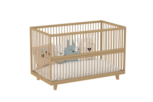
Now here is a color you don’t often see in nurseries: shades of brown. One might even think that brown is not remotely applicable to a kid’s room. Think again. One of the colors humans have evolved to see very well are shades of brown – from the muddy ground to the wooden forests. Earthy colors are also very easy on the eyes and help in relaxing. However, you might want to avoid them if your nursery doesn’t get enough natural light. Some shades to try are taupe, light beige, and chocolate brown.
- White &Grays
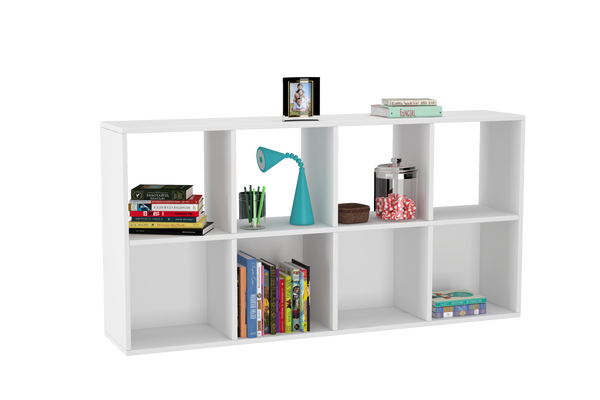
You can rarely go wrong with whites and grays, the most baby-friendly room color palettes. The color white is known best for its calming and soothing effect on the eyes. While other colors could be overstimulating, white can relax the eyes. Grays are the perfect neutral colors that could be matched with anything. White-gray tones, together, can be the perfect, durable color scheme. Some good shades include ivory white, pearl white, dove gray, and silver gray.
Choosing Colors: The Adult Perspective

A nursery should always keep the needs of the baby first. However, when all is said and done, there are a few “adult considerations” that also need to be kept in mind. Here are a few of them:
Consider the size: The size of the room can be a valuable factor in deciding colors for it. Dark colors tend to lack depth, so could make the room size appear smaller. On the other hand, bold accents can give the illusion of depth and make even a small room appear larger.
Think long term: Always remember that your wallpaint would last longer than most trends. Do not jump on the “latest idea” that hasn’t been established yet. The same point applies to the kids too: baby room colors like pink or blue, already abundant everywhere, might bore your kid quite soon.
Consider the fabrics: Fabrics like curtains and bedsheets can be just the garnish you need to finish off your room décor. But you would have to decide that while you pick the color scheme for the room. If your nursery needs dark curtains (due to excess sunlight), think how well your wall color would blend with it.
Find the balance: There are two extreme ends – painting everything with the same color or using dozens of colors to create a rainbow of a room. The right answer lies somewhere in between. Minimalistic color schemes can work, but kids need some colors in their lives. At the same time, too many colors could quickly become jarring and distracting.
Consider home color scheme: An important factor to consider would be the existing color scheme of the rest of the house. You would not want the nursery to look like “just another room” in the house; however, you also wouldn’t want it to pop out like a sore thumb. Think of what color scheme might match – closely, not exactly – with the rest of the home.
Play Safe Rather Than Bold: Our last nursery design tip would be against experimenting with the nursery colors for one simple reason – your kid lives there. Go with tried-and-tested options rather than something radical. Minimalistic color schemes, pastel shades, and two-tone contrasting colors are some of the ideas that work very well.
Conclusion
Playing with colors is always a fun idea. But now, we hope, you are aware of the important impact colors could actually have on your kids. Colors make our lives all the more beautiful, so here is a wonderful opportunity for you with plenty of nursery color choices. You can go ahead and paint the perfect abode for your little one; a place that’s vibrant and safe for them. Best of luck!